Kitchen Remodel Ideas 2022

The 1990s doesn’t seem too far in the past. But the home styles of that decade were distinct and didn’t exactly land in the “timeless” category. Ultra-earthy tones, oak cabinets, and more were everywhere. If you’ve got a kitchen that was finished in the heyday of that time period, you’re probably dying for an update.
Why should you remodel your kitchen?
Green Heights Trail
Over the years, the owners of this home tried to update their kitchen. But unfortunately, the room was covered in 1990s style and earth tones. And paint and hardware could only go so far. Oak cabinets, rusty red walls, and brown granite took center stage. The finishes were all mix & match styles and metals that appeared disconnected and unfinished.
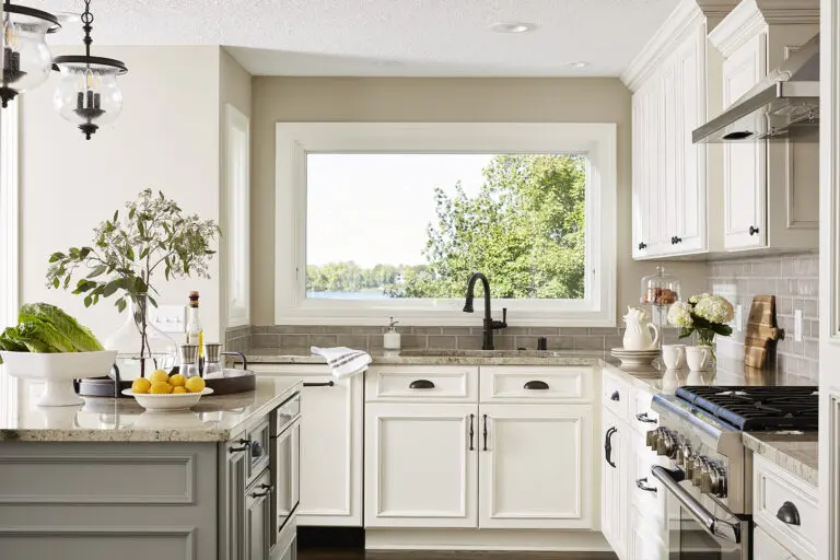
Our goal was to brighten everything up and keep a cohesive classic vibe. Doing this, we knew we could completely shift the look and feel of the kitchen. Out went the oak cabinets and the outdated colors. In came warm white cabinets paired with a soft grey center island in an upgraded and refined shape (with plenty of storage beneath). The granite countertops blended warm and cool tones, and a warm grey backsplash connected the space.
For finishes, we kept things simple and classic. We used oil-rubbed bronze for the faucet, light fixtures, and cabinet hardware. Paired with this, we opted for sleek stainless-steel appliances with the refrigerator hidden behind cabinet panels for a sleek and bright look. Overall, the kitchen became a visual beauty. And beyond that, it was also a space with plenty of room to comfortably enjoy day-to-day tasks.
Nevada Avenue
The oak cabinets, deep tones, and outdated countertops had to go. But beyond that, what this space needed more than anything was to be opened up. Separate dining spaces were popular in the 1990s. However, the open layouts of contemporary design are much more user-friendly in today’s world. The owners definitely wanted their home to feel more connected.
This separate formal dining room was spacious but felt disconnected from the activity of the kitchen (and as a result, was not used as much).
We made the biggest change by opening up the dividing wall between the kitchen and dining room. This connected each area and increased movement throughout the space. We opted for darker stained cabinetry for a sophisticated look. Then we contrasted these with a warm white kitchen island (and plenty of extra seating!). We chose finishes and hardware in stainless steel and brushed nickel. Furthermore, we used clear pendants above the island to keep things feeling light and airy. From cramped to classic, the remodel instantly transformed this kitchen.
Oak Drive
This kitchen was open to the adjoining dining and living room spaces. Yet it was still outdated with its light maple wood cabinets, dark granite, and sharp angles. The green walls were a bit too warm and muted as well. Overall, the space needed a contemporary upgrade.
We kept the general layout the same. After all, the biggest need in this kitchen was a brighter aesthetic and more contemporary finishes. So, we opted for a modern farmhouse look. We installed a reclaimed wood island, a built-in dining banquette, bright white subway tile for the backsplash, and warm white cabinetry. The result was a bright and airy space that felt both open and fresh.
Pheasant Ridge Road
This kitchen had some nice elements. But the owners wanted to ditch the two-tiered kitchen peninsula. There was ample room to cook, certainly, in the original design. Yet, the space still felt outdated and too dark. And as we know, that was a hallmark trend combination of the 1990s.
We kept the general layout of this kitchen the same since it worked overall. Then we made some significant changes that helped open up the space and add function. We first replaced the peninsula with a more contemporary rounded island. This eliminated the extra tier in the process. As a result, the countertop was much wider and the view was not blocked. In addition, we completely eliminated the center coffee kitchen island. Instead, we created a coffee nook in the corner, which increased the floor space.
AFTER – COLOR PALETTE
And finally, we brightened everything up with white cabinets, stainless steel and brushed nickel finishes, and a classic subway tile backsplash. With grey walls to contrast it all, it became an instant family favorite. It was fit for everything from cooking to entertaining. For more information about choosing paint colors for your check out our Best Paint Colors for your 90s-Era Home blog post.
Ready to tackle that outdated 1990s-style kitchen? Pull a bit of inspiration from these projects. We guarantee your home will feel brand new and exactly as you imagined it to be. For even more 90s-era home transformation inspiration take a look at my Jordan Project.
OH! Be sure to UNLOCK YOUR PERSONAL DESIGN STYLE, take our fun and FREE QUIZ!
By Megan Johansson, Contributor to Carla Bast Design

